5
5
Verde Sazón
Verde Sazón
Client
Client
Roberto Luque
Roberto Luque
Type
Type
Type
Type
,
,
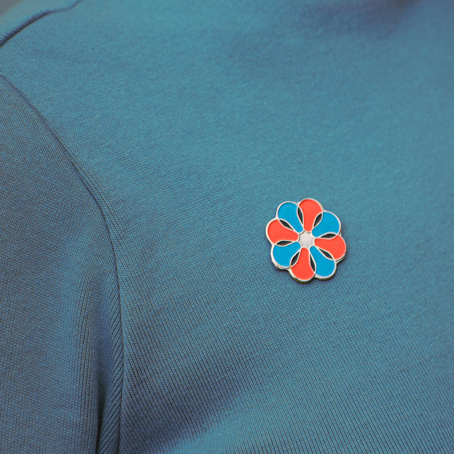
Brand Identity
Brand Identity
Year
Year
2021
2021
About
About
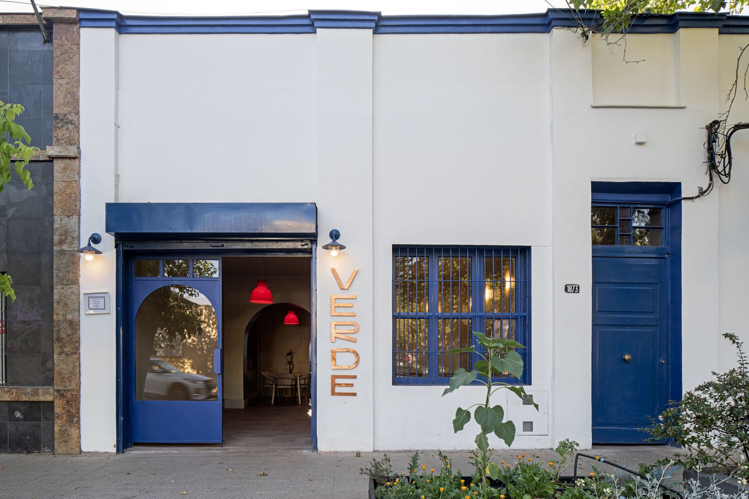
The identity is anchored by Sazón, a bespoke all-caps typeface that we designed specifically for the project. Inspired by the old storefront signage of Barrio Italia, where the restaurant is located, the font reflects the spirit and character of its surroundings. When you create something by hand, like this typeface or the recipes themselves, imperfections inevitably become part of the final result. Yet those very imperfections are what make a place feel alive, real, and truly lovable.
The identity is anchored by Sazón, a bespoke all-caps typeface that we designed specifically for the project. Inspired by the old storefront signage of Barrio Italia, where the restaurant is located, the font reflects the spirit and character of its surroundings. When you create something by hand, like this typeface or the recipes themselves, imperfections inevitably become part of the final result. Yet those very imperfections are what make a place feel alive, real, and truly lovable.


Credits
Quote
Credits
Quote
More works